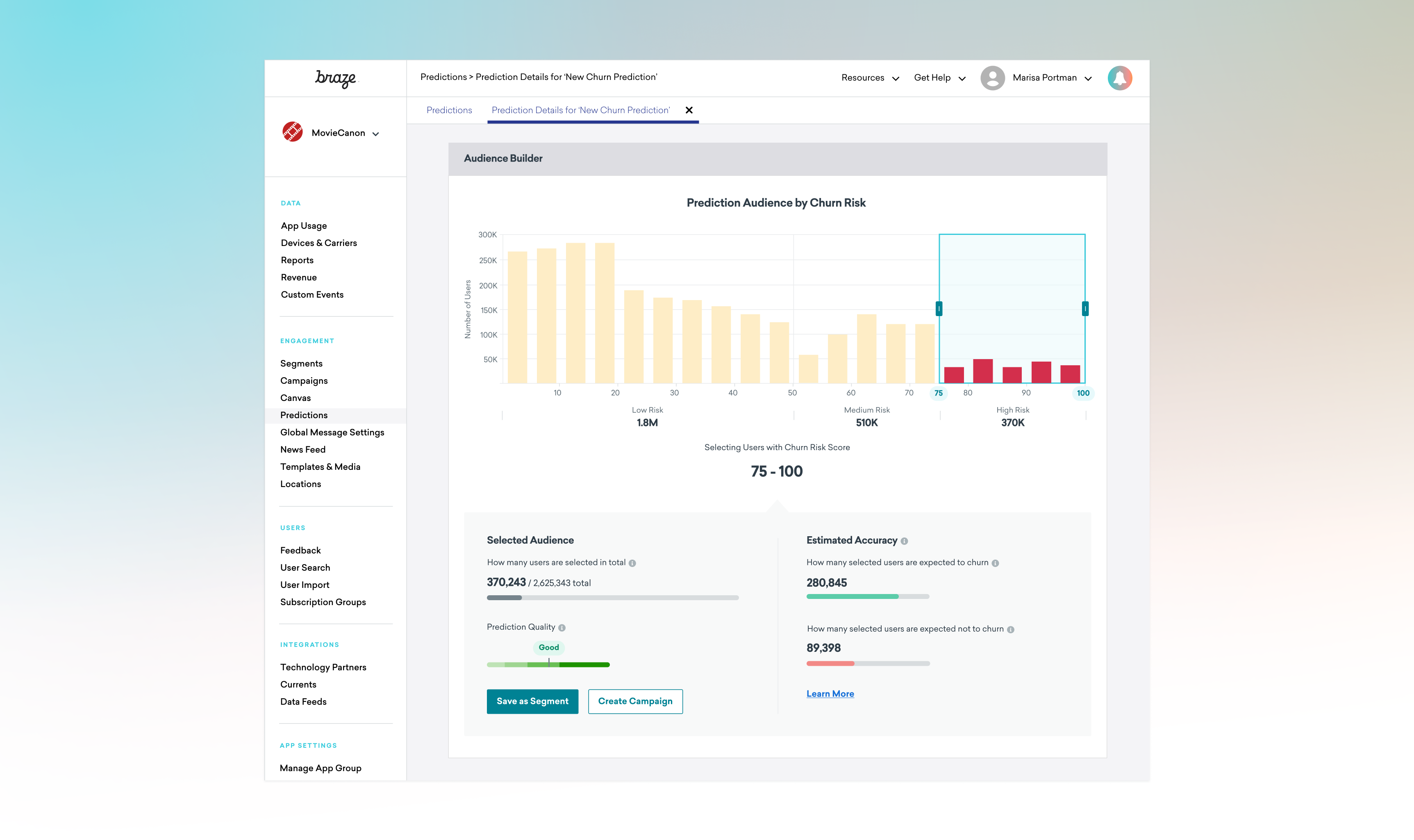
Braze, a leader in customer engagement, has been investing in leveraging artificial intelligence (AI) to enable marketers to advance campaign strategies. I led the design for Predictive Churn, Braze's first AI-powered product that enables marketers to create models that predict user churning (disengagement). I was tasked with redesigning the beta version for the public launch from April 2020 to August 2020. I collaborated with 1 Product Manager, 1 User Researcher, 2 Data Scientists, and 4 Engineers.

As a marketer, the goal is to engage and retain users by sending them the right message at the right time. However, to do this at scale is no easy task. It requires sophisticated machine learning models to turn the data into actionable insights at a user level. Marketers often rely on a team of data scientists to build these models. With resource constraints and sometimes lack of priority, it can take months to see any model results. With Predictive Churn, we aimed to make it as easy as possible for marketers to create predictive models on their own, so they can focus on engaging and retaining users with data insights.
I started by looking at relevant products on the market to get a better understanding of how AI has been used in marketing technology. This provided me with a perspective on the larger context in which our project was scoped.

Feature matrix for AI/ML in Marketing
We interviewed 8 beta users and had them walk us through how they’ve used the initial version. Below is a summary of the pain points:
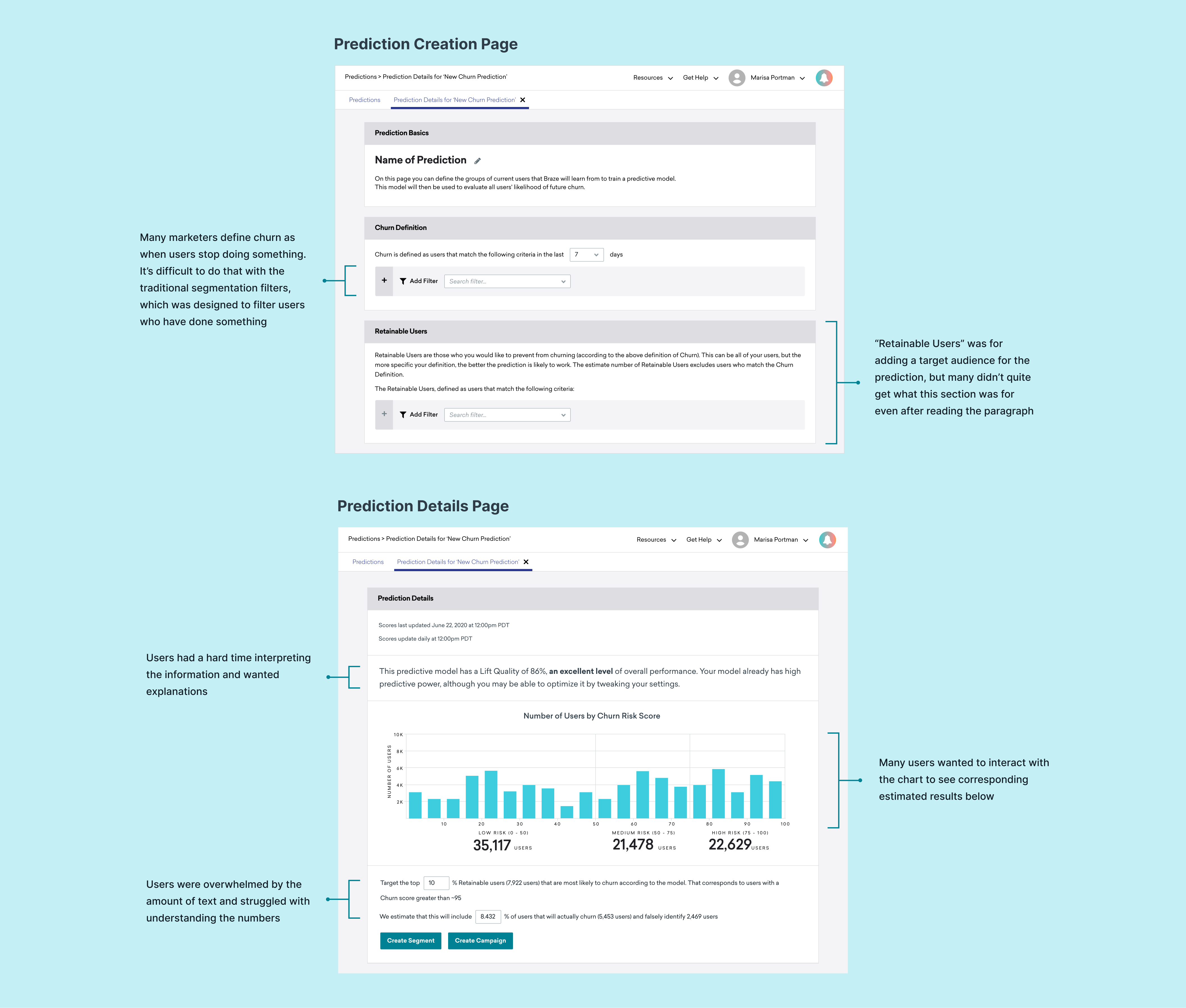
A typical marketer has little knowledge about machine learning, so we need to make the process of creating a prediction model and analyzing the results as simple as possible, while maintaining a level of transparency that builds trust. The goals for the iterations are broken down to:

Journey of marketers using Predictions in their workflow
We hosted a sketching session with engineers, data scientists, product managers, and designers from other product verticals. This collaborative format allowed us to bring different and fresh perspectives and ideas to the table. I started gathering all the ideas and converging them into multiple concepts.
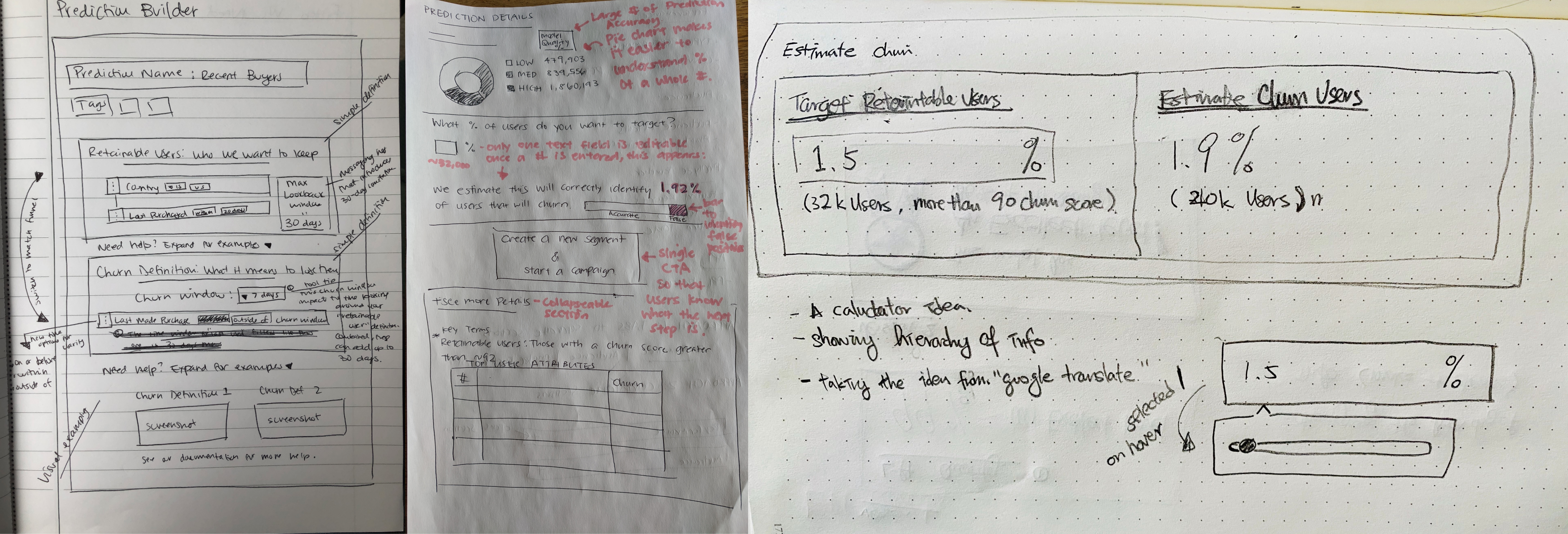
Some of the sketches from the sketching session
For the Prediction Creation page, I wanted to minimize the amount of the text users need to digest upfront, so they can focus on creating the model as quickly as possible. Below is my initial exploration.

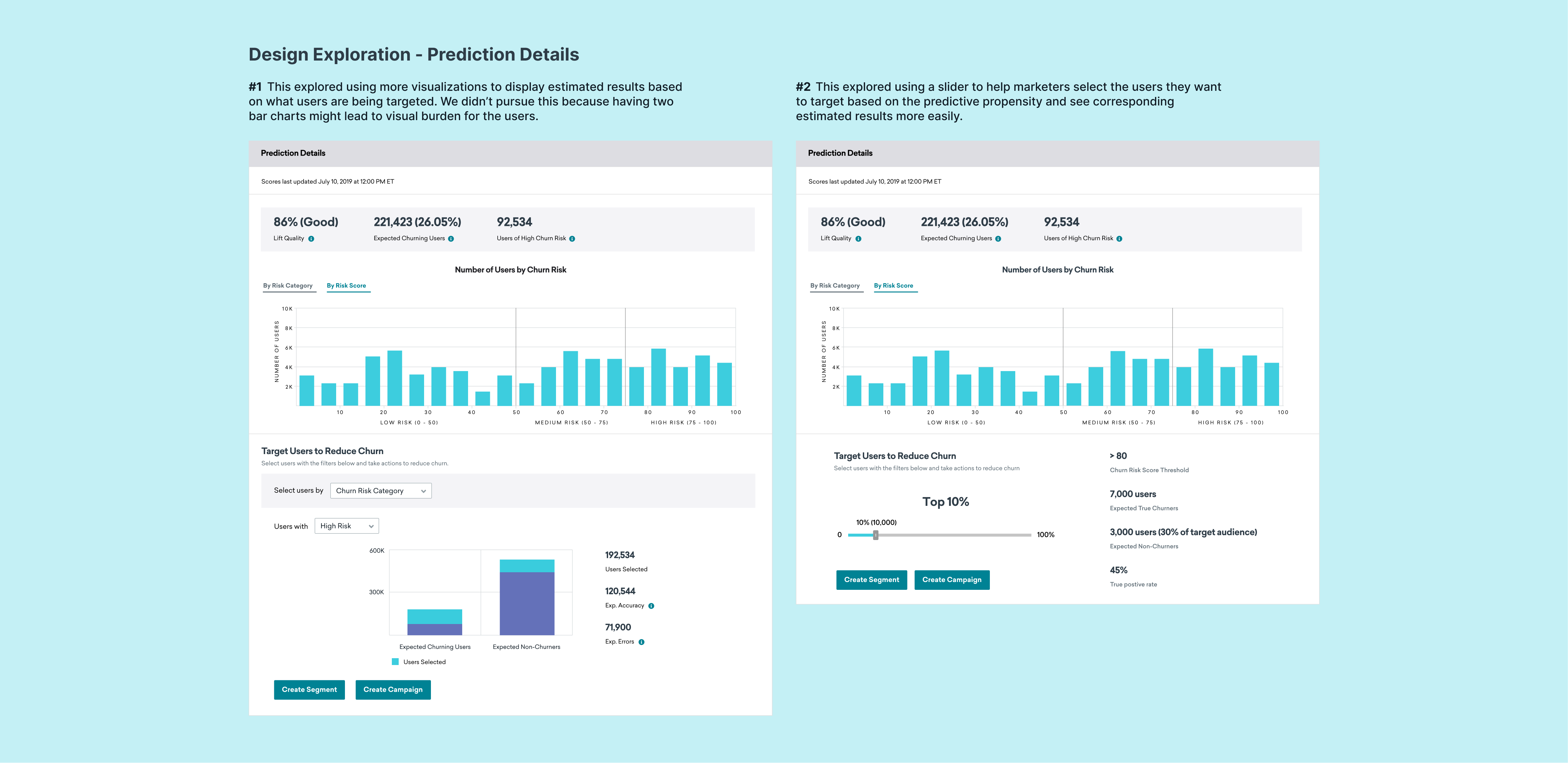
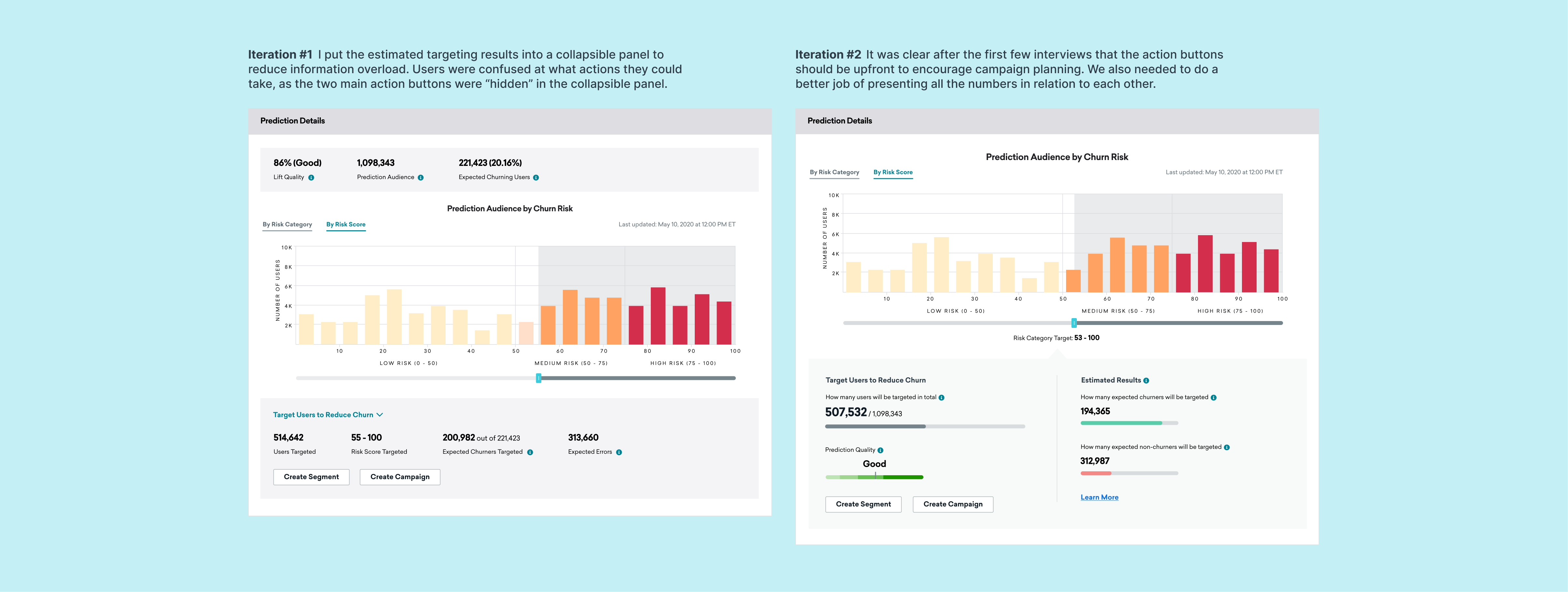
For the Prediction Details page, we focused on helping marketers better understand the results and making it easy to target the users with they want. Below are some explorations.
We conducted usability testing with 9 customers over Zoom to test how users would interact with the model results. The conversations helped us understand where users were stuck, and further confirmed our initial discovery finding that users expect to see information about what the model is taking into account to generate results.
After the testing, we launched the first version of Predictive Churn. In the first few months, we noticed that almost 70% of the users who started the creation process left without successfully building one. To understand why, we observed over 100 user sessions on FullStory.

User behaviors analysis from FullStory
We found that when all the settings are on one page, it was difficult to understand what to do when errors due to insufficient data occurred. Users were struggling with understanding how to resolve with errors with ambiguous guidance, and many of them left because they were stuck.

With this iteration, I separated each configuration for creating a prediction into a one-page step, allowing users to focus on one task at a time without getting distracted by errors from other settings. We tested this design with 12 users, and all of them were able to complete the tasks and satisfied with the flow.

Below is a walkthrough of the final design.

There was a lot of ambiguity in designing a technical product such as Predictive Churn for a non-technical audience, and especially for Braze, it was our first end-to-end AI-powered product offering. I learned to stick with talking to users and observing the data to understand the user problems. By putting users first, I was able to get answers to many challenging questions and find confidence in my decision-making.